Response on Chapter 11 of the VAD book by Tamara Munzner

Chapter 11 started the discussion about manipulations. Especially changing view over time.

After going through the chapter, I’m a little curious about the difference on visual encoding and potential impact on users between cut and slice in terms of reducing attributes.

The first question is easy to answer. A cut put a plane that divides the viewing volume into two and hiding the part that is close to the camera. And slice is just filtering data by one specific value. Slice is more general in terms of filtering, and cut can be made into a slice if the camera (in 3D case) is put deliberately to only show the plane cut.

After figuring out the difference of two visual encodings, now we can discuss on what impact those two manipulation will have on the users. The main attribute that sets cut apart from slice is that it could leave more information. Just like the brain example in the book, users are still be able to see the facial part of the head. This could potentially carry more useful information, e.g. how can the subject’s facial expression change according to brain activity. Or it could be simply more engaging for users to look at especially those are not professional. The downside of this is that we are consuming more memory, and if a slice would work if we want to get rid of noise or memory consumption is a concern.

Assignment5: Data Vis Using R

Who had the highest number of home runs (HR)?

Hitter-Homerun Bar Chart

Reggie Jackson.

Who had the maximum number of hits in 1986?

Hitter-Hits Bar Chart

Don Mattingly.

Name the second most expensive team in the league?

Hitter-Hits Bar Chart

The team in Los Angeles.

Specific Goal:

Are players paid according to their performance?

Don’t know too much about baseball, but for the hitter data there is actually one player that has very low homerun in career but given insanely high salary in the whole league.

Homerun-Salary

By querying using R, the name is Mike Schmidt.

README

R would be a great tool for people who don’t have a lot programming background but want to manipulate data programmatically.

Assignment4: Data Vis Using Tableau Part2

The Infant Mortality Data

I accidentally found this data from the Rdatasets, and it reminds me of Hans Roslin’s TED talk. So I decided to play around with it. (This data differs from Hans Roslin’s data in that it only captures the year 1970.)

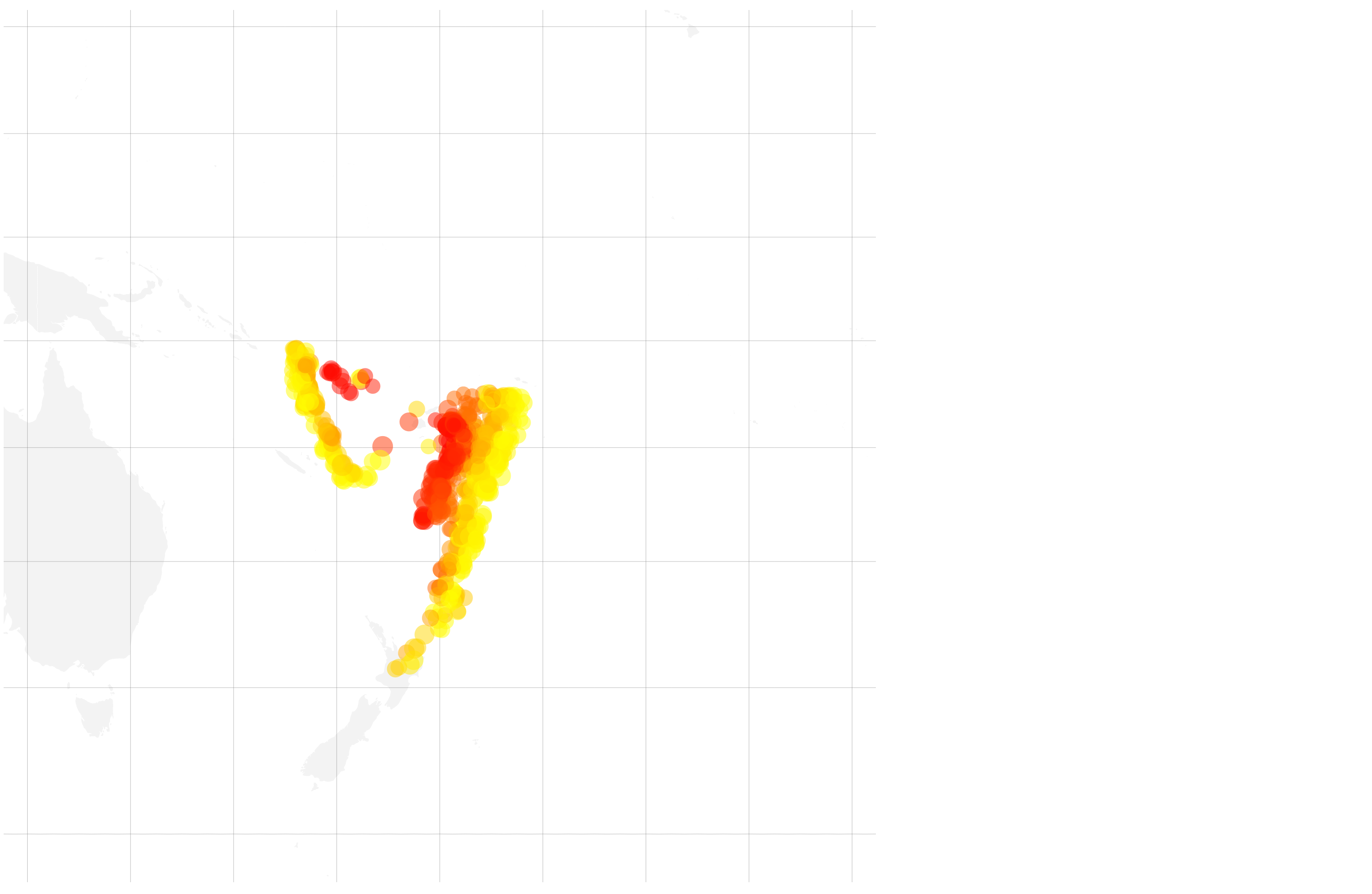
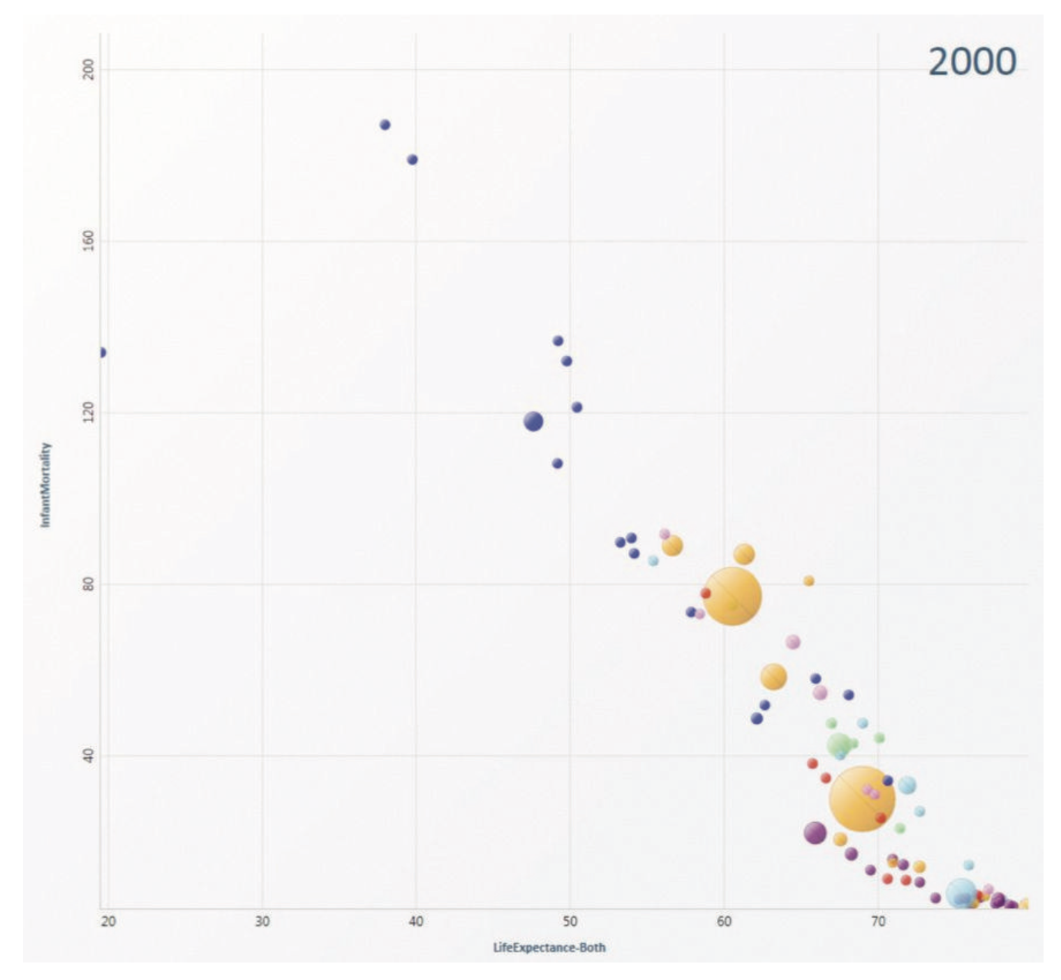
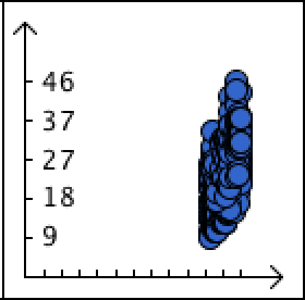
Correlation between infant mortality and income of a country.

Mortality-Income

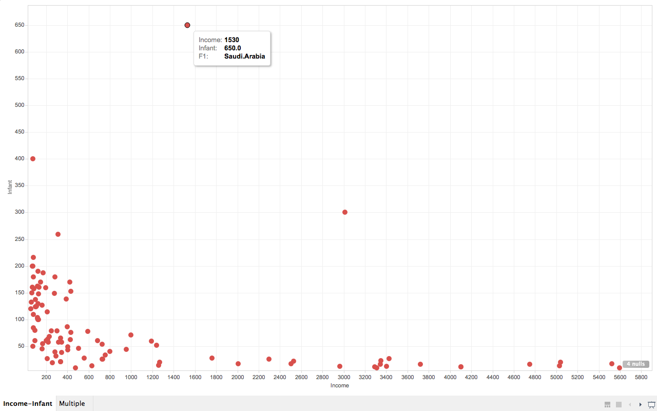
As we can see from the screenshot, countries that are very poor have higher infant mortality than other countries are reasonably wealthy. But wait, what are the three points that are extremely apart from their peers (with similar income)?

So far I’ve only used drag-and-drop for dimensions and measures, and turns out Tableau knows what I want to do next, it allows user to drag and drop attributes in interest to “tooltip”. So I did it. And immediately it gives me a tooltip not only showing the dimension data, but also the extra attribute I just drag-and-dropped. And we can easily know that the three countries are (from left to right), Afghanistan, Saudi.Arabia and Libya and all of them are oil exporting countries! I’m not going to talk about world politics but the correlation to oil may reveal something.

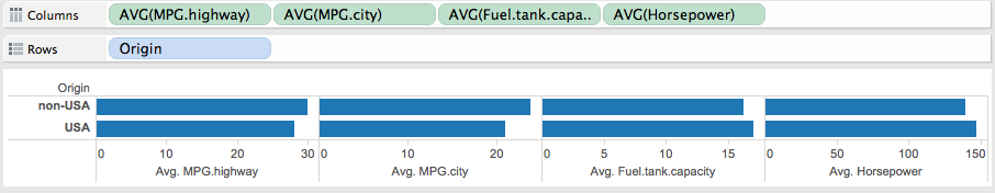
Infant mortality and income according to regions.

Mortality-Region

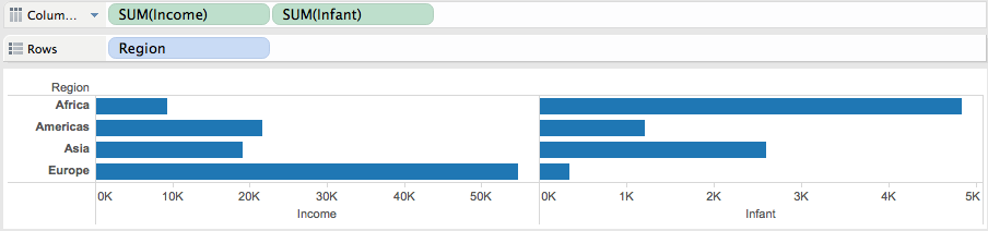
By comparing infant mortality and income according to regions we easily know that Europe is the wealthiest and has lowest infant mortality, while Africa is in the reversed case. But Asia is not as wealthy as America but has lower infant mortality. Presumably the reason is that although Asia is not as economically strong as America countries, but by that time most countries in Asia is in a more stable state than their peers in some of the American countries. But to verify this point we need some other data support.

Wife Working Hours

This data demonstrates the working hours of the wife in United States families. It is more interesting if you have a wife :P

Multiple factors that affecting wives’ working hours.

Multiple-Hours

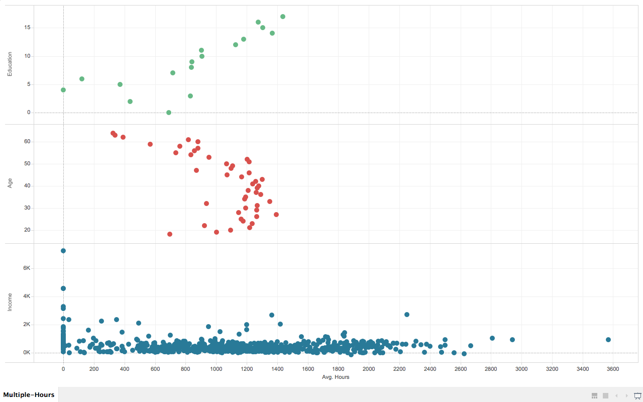
In this chart, I deliberately chose three different factors that displays interesting pattern to the wives’ average working hours.

They are wives’ education level (measured in years, the more the higher), age, and husbands’ income.

In the first (from top to bottom) section of the graph, we know that wives that are more educated tend to work longer.

In the second section, the pattern shows that wives who are working most of the hours are between 52 and 21 years old.

In the third section, most of the wives who are working more than 400 hours per year has a husband that earns less than 3K per year (1987’s data).

README & Thoughts

How to use

You can download the Tablau Work Book files and the data here. In case it prompts data cannot be found, just use the data in the archive to replace the original data, since tableau seems to use absolute path.

Thoughts

This is the first non-coding assignment this semester, (hopefully the last ;P) which requires us to use Tableau.

I usually am not very patient with those “mouse-driven” applications that are advanced to an extent that targeted users are supposed to get their job done by only clicking their mouse. The reason is simple, because usually those tools will have some kind of limitations. But after a while using it, I actually found it was quite enjoyable to use it, the UI is quite intuitive and fluid in the mean time powerful. I believe it is a great tool that has the capability to let people who barely know computer science carry out much more complicated tasks in their daily works.

Assignment4: Data Vis Using Tableau Part1

The Car Data

Let’s dig deep into our good old car data. This time we are going to answer 6 car related questions, each one will have a picture associated.

Which car has the highest city mpg?

Car-City.MPG

Answer:
Geo Metro has the highest city mpg.

How:
Set the manufacturer-model tuple as the column dimension and city MPG as the row measure, we can get the data simply even without any filtering.

Is there a correlation between a cars highway mpg and its weight?

Weight-Highway.MPG

Answer:
There is a reverse correlation between a car’s highway mpg and its weight.

How:
Drag weight and highway MPG to row and column respectively and set both of them to dimension by clicking the menu item in the dropdown of each dimension. Ugly as it may perceive, we get the correlation immediately.

Which car has six cylinders and still has a highway mpg that is above 30?

Cylinders-Highway.MPG

Answer:
Ford Taurus.

How:
Do the similar drag-and-drop as before, but this time we need to apply two filters to nail number of cylinders down to 6 and highway mpg to 30. And we got only one point on the chart.

Which is the most expensive 5-seater car?

Passengers-Prices

Answer:
Mercedes-Benz 300E.

How:
Drag-and-drop, apply filter to 5 passengers and boom..

Is there a relationship between a cars horsepower and its weight? If so, what is it?

Weight-Horsepower

Answer:
Higher the horsepower, heavier the car.

How:
Drag-and-drop. Then select dimension instead of measure from the dropdown.

Name any other interesting correlations that you find through interacting with the data.

Multiple

Answer:
I tried to explore different attributes according to cars origin. And interestingly, I was able to recognize a pattern that USA manufactured cars burn more oil, have bigger fuel tank and have higher horsepower than non-USA manufactured cars. Guess USA people are more dynamic than other countries huh?

How:
Drag-and-drop, then select average for all the measures in column.

Response on Chapter 9 of the VAD Book by Tamara Munzner

I always feel networks and trees are the most “humane” visual encodings in the visualization world. You may ask why, because all of those visual encodings represent relationships between objects and relationship is the core of everybody’s daily life.

Given the nature of those kinds of encodings, trees and networks displays their strength in solving a lot of real life problems. One of the interesting demonstration can be seen here. We are also trying to build an anime visualization (coming soon) which is used to answer questions like similar animes using those visual encodings. And they are also widely used in Genealogy and Biology.

Response on Chapter 5 of the VAD Book by Tamara Munzner

Data visualization is all about using visual channels to convey information to the user (reader.). In this chapter the author is mainly focused on the “Marks and Channels” which are very good tools to analyze visual encodings.

After a quick scan through the chapter, I realized that the chapter can be roughtly divided into two parts: Definition and Utilization.

The first part describes the definition of marks and channels.

A proper way to categorize marks is the number of dimensions, shown in the picture below.

Marks

Channels

Versatile as the visual channel, it is basically the organization of marks in different forms. And usually we use the composite of different visual channels.

In the second part, the author is trying to express the pros and cons in using visual channels in visual encoding. And she focused mostly on the effectiveness of different channels.

She also gives a ranking for effectiveness and expressiveness of different visual channels.

Under the hood, I think the limitation of different visual channels is mainly affected by human perceptions, and the result or conclusions described in the chapter should be years of research experience.

Conclusion is, we should be careful when we are designing or implementing our own visualizations in terms of visual encodings.

Knock knock, I will end this blog with one of my favorite picture to emphasize that human perceptions can sometimes lead to illusions;)

Illusion

Assignment2: Data Vis Using P5.js

README

This is a small project to get familiar with P5.js. As mentioned, the only purpose of the code here is to display a specific dataset (U.S. Presidents rating from 1945 - 1974 in this case.).

Implemented features are as following:

  1. Showing the same dataset using bar chart, stacked bar chart, scatterplot, line graph and box plot.
  2. All vis are interactive (highlighting and showing tooltips) except for box plot.

Links

See Bar Chart

Bar Chart

See Stacked Bar Chart

Stacked Bar Chart

See Scatterplot

Scatterplot

See Line Graph

Line Graph

See Box Plot

Box Plot

Note

Below is a faked dataset to show outliers. The faked test data can also be acquired here.

Fake Data to Show Outliers

Response on Chapter 7 of the VAD Book by Tamara Munzner

Summary

As usual, I posted the chart at the top of Chapter 7 which best summarizes what the author talks about in this chapter.

Synopsis

In this chapter the author described different encoding heuristics for how to arrange tabular data spatially. There are several design points we can consider according to the book. More specifically they are value arrangement, region arrangement, axis orientation and layout density.

Different design points focus on some specific requirement, e,g., a bar chart make comparison much easier and also focus on the feasibility, e.g., scatterplot is most suitable for two-value tables.

Interesting Point

The concept that’s quite new to me is the introduction of heatmaps. Although I have seen heatmap almost everyday, I didn’t know anything about it. Below is one of my favorite heatmap:

Github Activity Indicator

Heatmaps are mainly used to encode data that has two key attributes which usually are ordinal or categorical. And one value that has no more than a dozen levels. As shown in the picture above. The heatmap uses weekdays and data as the keys, and different colors to encode number of commits. There are several critical points we need to consider when using heatmaps. The first is the color encoding of levels should be reasonable to human intuitions. For example, darker usually means more, in the contribution graph above, if we use lighter color for less contribution, I think people will hate Github. And also the number of levels should not be too many, as described in the book. I think it’s the average number of different colors we can store in our human GPU when processing the vis.

Evolve on the Originals

The author also mentioned the idea of aggregating information on a given encoding idiom. My favorite is the use of glyph in value encodings. (See the picture below).

Glyph Example

The scatterplot above uses glyph which is a bigger circle with color to indicate the life expectancy and infant morality for one country. From the graph we can know quickly the country we are looking for, or it speeds up locating and querying by using the term introduced in the book. And if you’ve seen the video you will know that the glyph introduces more possibilities for manipulation. The user can break out those bigger circles to get the data points belongs to that country, which is very cool.

Assignment1: Data Vis Using Processing

README

This is a really simple version of CSV visualizer implemented using JAVA and Processing. To download the source code and executable, please click here. Simply double-click on the jar file to execute. You will get the test data after extracting the .zip file.

Note: You might need to install JRE6 on OSX to execute the jar file.

It has several features:

  1. You can use the “Import” button to select the input CSV file. The file must contain a header for its columns.
  2. After importing the file, the CSV Drawer will recognize the dimension of the input data and visualize the data using either a bar chart (1 dimensional data), scatterplot (2 dimensional data) or a scatterplot matrix (3 or more).
  3. Currently this vis only supports number based input. Which means for a CSV file that contains NAN values (like strings in a column), the data points will be skipped. And if the whole column is NAN, then the whole column is skipped.
  4. The vis implements basic user interactions. a) When the user moves the mouse over one data point the data point will be highlighted and a small tooltip will illustrate the actual data for this point. b) If user clicks on a specific chart, there will be slider(s) appearing to the right of the “import” button. And user could use the slider(s) to filter the data displayed on the chart. Note: For scatterplot matrix you need to click on the small graph in the grid to display the sliders for that chart.

Screenshots

A Simple Bar Chart

File Selection

A Simple Scatterplot

A Simple Scatterplot Matrix

Bigger Dataset for Scatterplot Matrix with Filtering

Insights on the Car Data

By looking at the last picture in the screenshots section above, it certainly revealed some interesting patterns in the car dataset.

Insight 1

X: Year, Y: MPG

Slider

The little screenshot above combined with the minimum value for the slider tells us that the earliest year of the whole dataset is 1969. (Maybe domestic car is not widely manufactured before that time?)

Insight 2

X: Year, Y: MPG Filtered

In this screenshot we can see a point is left alone. And it becomes very clear after filtering that the highest MPG (miles per gallon) we can get in 1971 is 35. (And it’s way higher than peers!)

Insight 3

X: Horsepower, Y: MPG

From this screenshot I know even without very sufficient common knowledge about cars that: the higher the horsepower, the lower the mpg we get from a car.

And seems this link verifies this conclusion.