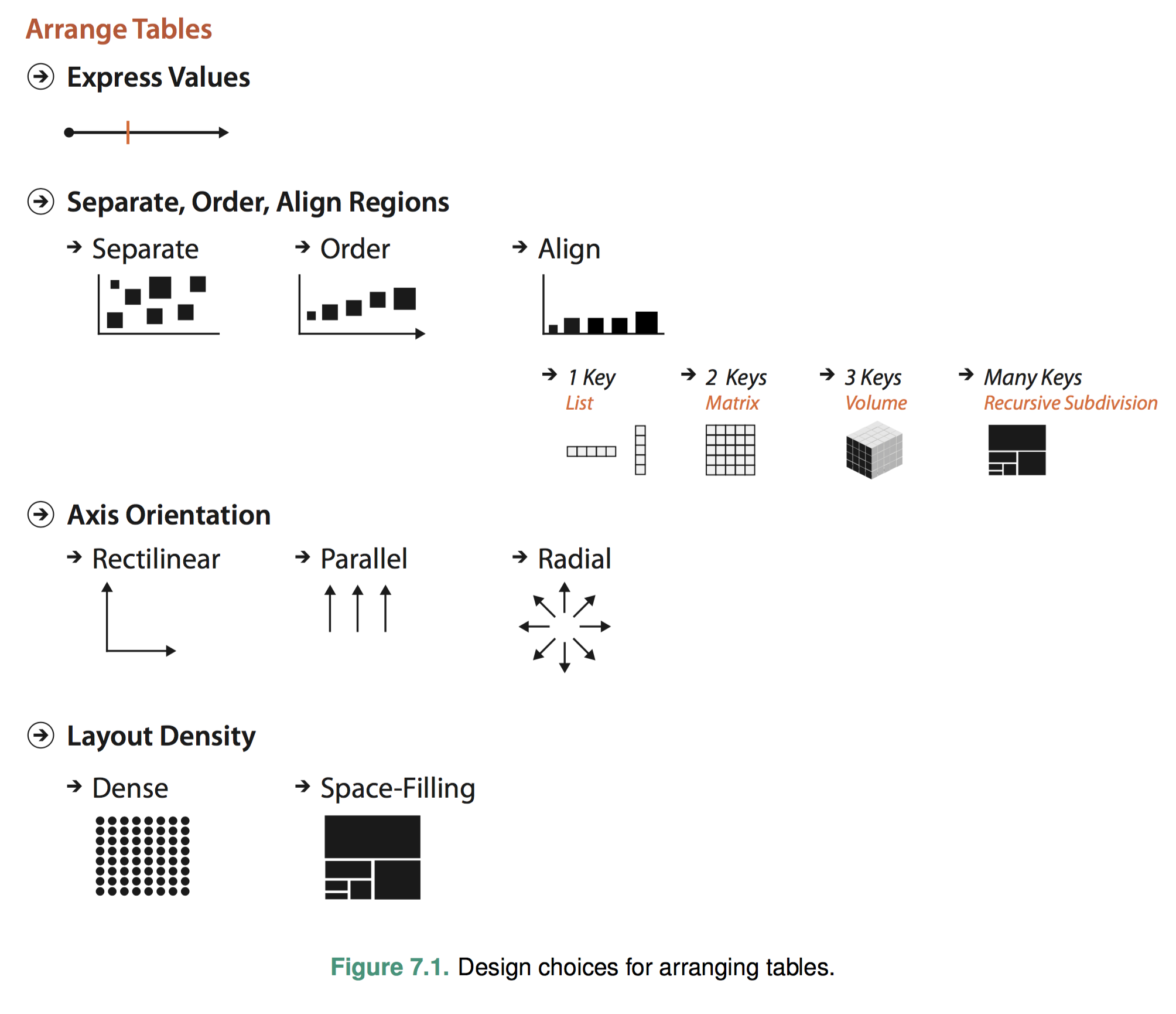
As usual, I posted the chart at the top of Chapter 7 which best summarizes what the author talks about in this chapter.
Synopsis
In this chapter the author described different encoding heuristics for how to arrange tabular data spatially. There are several design points we can consider according to the book. More specifically they are value arrangement, region arrangement, axis orientation and layout density.
Different design points focus on some specific requirement, e,g., a bar chart make comparison much easier and also focus on the feasibility, e.g., scatterplot is most suitable for two-value tables.
Interesting Point
The concept that’s quite new to me is the introduction of heatmaps. Although I have seen heatmap almost everyday, I didn’t know anything about it. Below is one of my favorite heatmap:
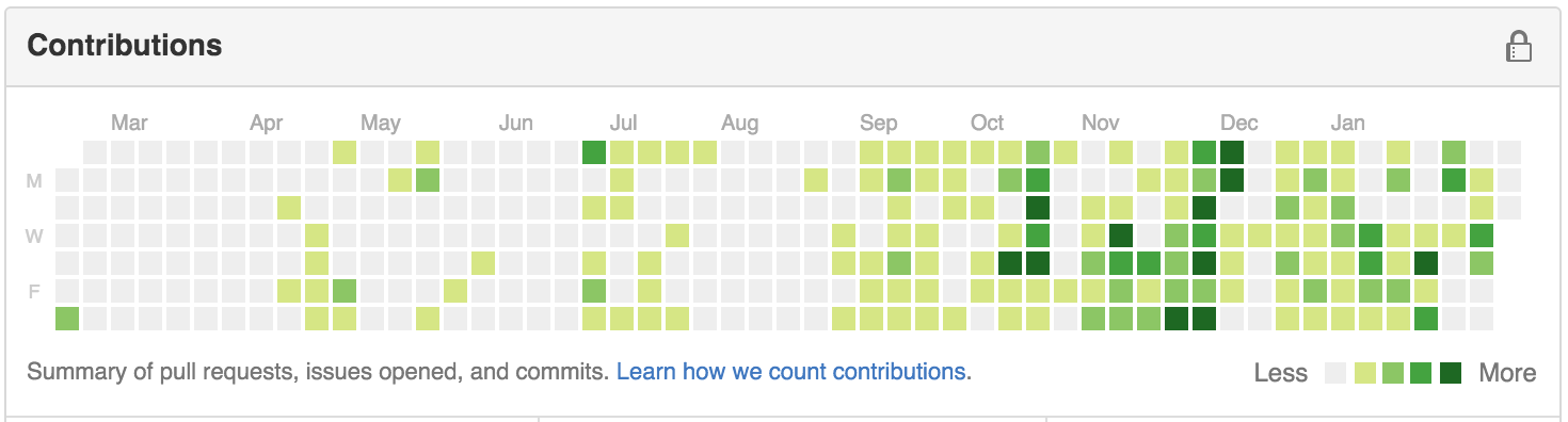
Heatmaps are mainly used to encode data that has two key attributes which usually are ordinal or categorical. And one value that has no more than a dozen levels. As shown in the picture above. The heatmap uses weekdays and data as the keys, and different colors to encode number of commits. There are several critical points we need to consider when using heatmaps. The first is the color encoding of levels should be reasonable to human intuitions. For example, darker usually means more, in the contribution graph above, if we use lighter color for less contribution, I think people will hate Github. And also the number of levels should not be too many, as described in the book. I think it’s the average number of different colors we can store in our human GPU when processing the vis.
Evolve on the Originals
The author also mentioned the idea of aggregating information on a given encoding idiom. My favorite is the use of glyph in value encodings. (See the picture below).
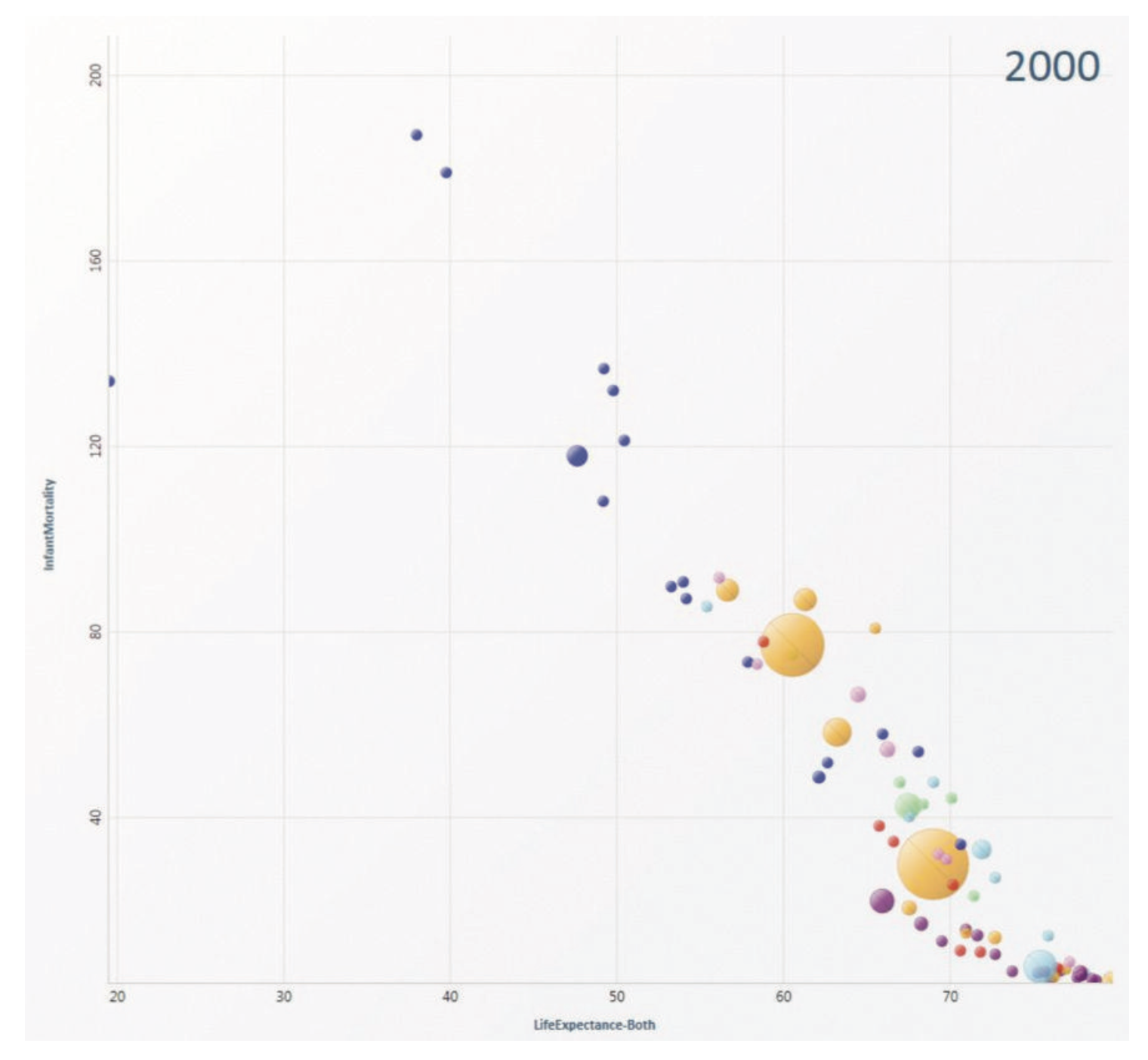
The scatterplot above uses glyph which is a bigger circle with color to indicate the life expectancy and infant morality for one country. From the graph we can know quickly the country we are looking for, or it speeds up locating and querying by using the term introduced in the book. And if you’ve seen the video you will know that the glyph introduces more possibilities for manipulation. The user can break out those bigger circles to get the data points belongs to that country, which is very cool.