Response on Chapter 4 of the VAD Book by Tamara Munzner

The Four-level Framework

In this chapter the author talked about the “Four-Level Validation Framework”. To be more specific they are “the domain situation”, “visual encoding interaction idiom”, “data/task abstraction” and “algorithm”.

And also we have different angles to attack those different layers. We could do it from bottom-up or we can also be driven by a specific problem. In a real situation the latter is more natural for people like myself because to me data vis is more like a tool to use to solve problems. So instead of investing years of time to researching how to build better lower infrastructure upon which people can build great data vis, I would rather start from a problem, build something that can be used and then figure out how to improve.

The takeaway is that data vis validation also could have a lot of potential traps. A good validation methodology is sometimes crucial and even trickier than figuring out a “solution” (this solution may not even be the thing our user wanted!).

Response on Chapter 3 of the VAD Book by Tamara Munzner

This chapter basically answers the question of “Why” we want to create a vis tool. The author carefully introduced the language we should use in analyzing and describing the “requirement” of the user. And at the end the author gave us several examples in the field to illustrate how are we going to use the “language” in the chapter to analyze different vis tools. This chapter serves as the very basis that we should at least be aware of in future when we are building vis tools.

Cool Vis Weekly Report #1

Strength of Nations

Time flew by, now is the beginning of the 3rd week of my last semester. There are so many things I want to build while so little time left before starting the mundane life as a “coding monkey” (Chinese word for software practitioners since in Chinese the word for programmer sounds like the monkey who writes code. Kind of like nerd used in English.). During the past two weeks I was coding day and night without too much time reading blogs or surfing online. While today when I finally opened up my Pinterest board, there is this cool data vis came into my sight. And the name for it is “Strength of Nations”.

The reason it caught my eye first is that it looks good. The combination of the colors used on the parchment forms a kind of harmony. Another example of a similar color usage is here. But some further reading revealed that this is actually a pretty decent vis in technical aspects. As we can see each node represents scientific publications in a particular topic, while the links shows publications that explore more than one topic or interdisciplinary researches. This vis tool not only makes it very easy to locate and query a single topic but also gives a clear emphasis on the relationships between different disciplines. For the screenshot we know immediately United States has a significant numbers of papers in the social sciences and medical sciences and also has strong interdisciplinary researches pertain to Biochemistry. And from the screenshot below showing the comparison of countries, we can acquire the likelihood of emphasis on different areas of research and by the first look we know that China and Taiwan have very similar research focuses.

Strength of Nations

Response on Chapter 2 of the VAD Book by Tamara Munzner

This Picture Stands for Chapter 2

Something about Chapter 2

The author introduced several “crosscutting” concepts that can guide design choices for a vis tool. To me, it’s more important to know these ideas if I still want to read the book. Instead of articulate the concepts in words, I think the vis at the beginning of this blog post stands for everything I need to know about Chapter 2.

There is one thing that stands out and make me think. It is the distinction between the abstract concept as a dataset and it’s visual representation in a vis tool. For example, a table dataset could be represented in a form of network or tree if there are inherent connections between the values in the cells. This realization is important because it allows us to break the design of a vis tool into two pieces which are the abstract dataset and its representation. For each piece we would have different set of methodologies to analyze it or make design decisions based on it.

Response on Chapter 1 of the VAD Book by Tamara Munzner

Cover of Visualization Analysis & Design by Tamara Munzner

This is a required response on the assigned reading of in CS686.
After reading the preface I realized that this book is really worth reading, at least for someone like me that doesn’t have any former experience in Data Visualization.

Something About the Book

Before this book, if you want to learn Data Visualization you have basically two choices. First is you could dive right into academic papers, and as said by Alark, those papers assume you knows a lot in the field. So the learning curve becomes very steep although the things you read is really “fresh” and you know right away where the idea originates from (may not be useful but sometimes makes me feel its more trust-worthy). Another way is to read some book that’s related to Data Visualization, like some Computer Graphics books, which don’t really talk about Data Visualization systematically, or some other books that really focused on the foundation of Data Visualization (the “from bottom to top way” as described by Tamara Munzner).

Neither of the two ways of learning gives readers enough insights with which they can use immediately into the projects they care about. And that’s the reason for the VAD book. Which focuses on the patterns & frameworks that help readers make the right design decisions and, even more, with those higher level concepts in mind it would become easier to read those academic papers if the reader wants to dig further.

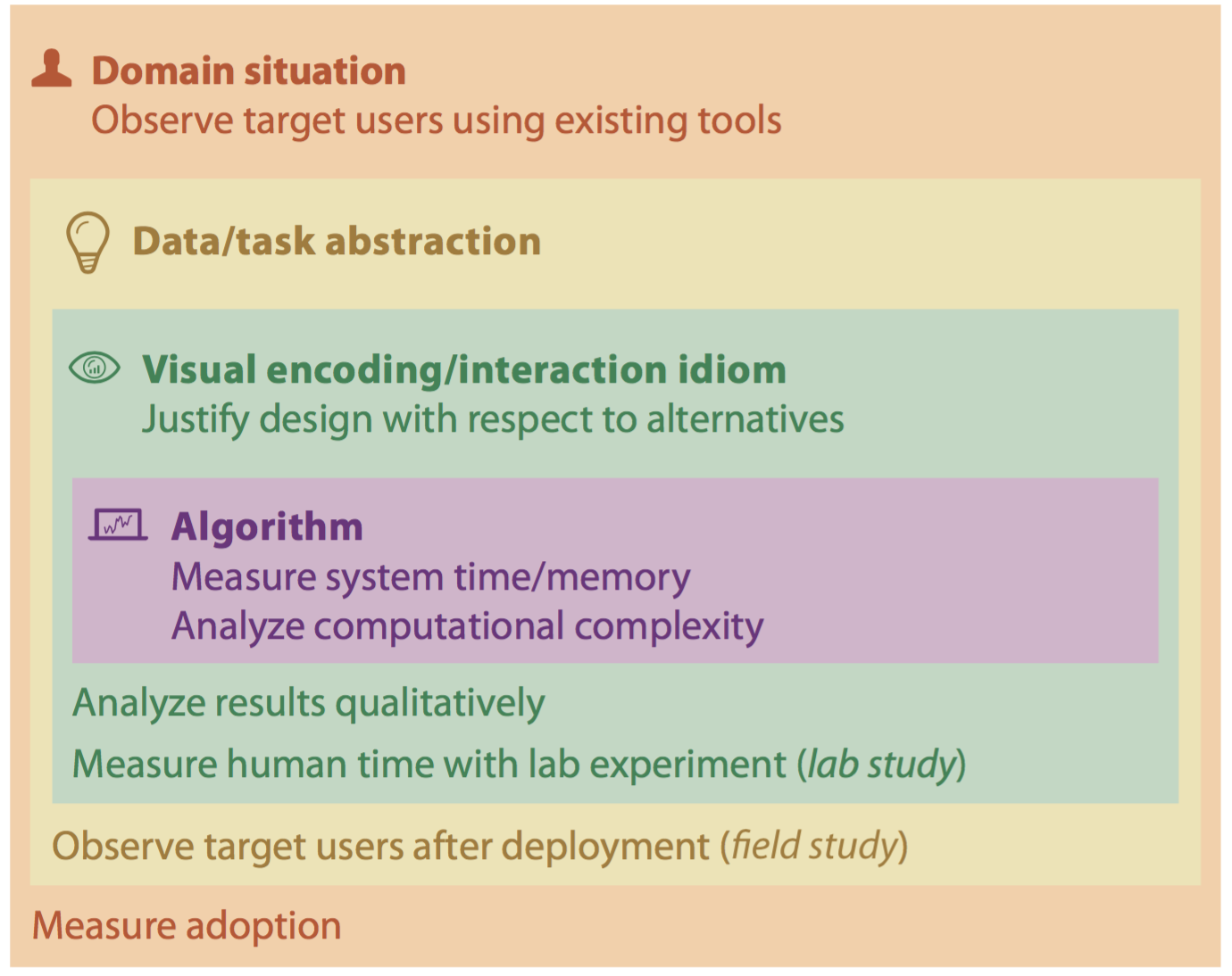
Something About Chapter 1

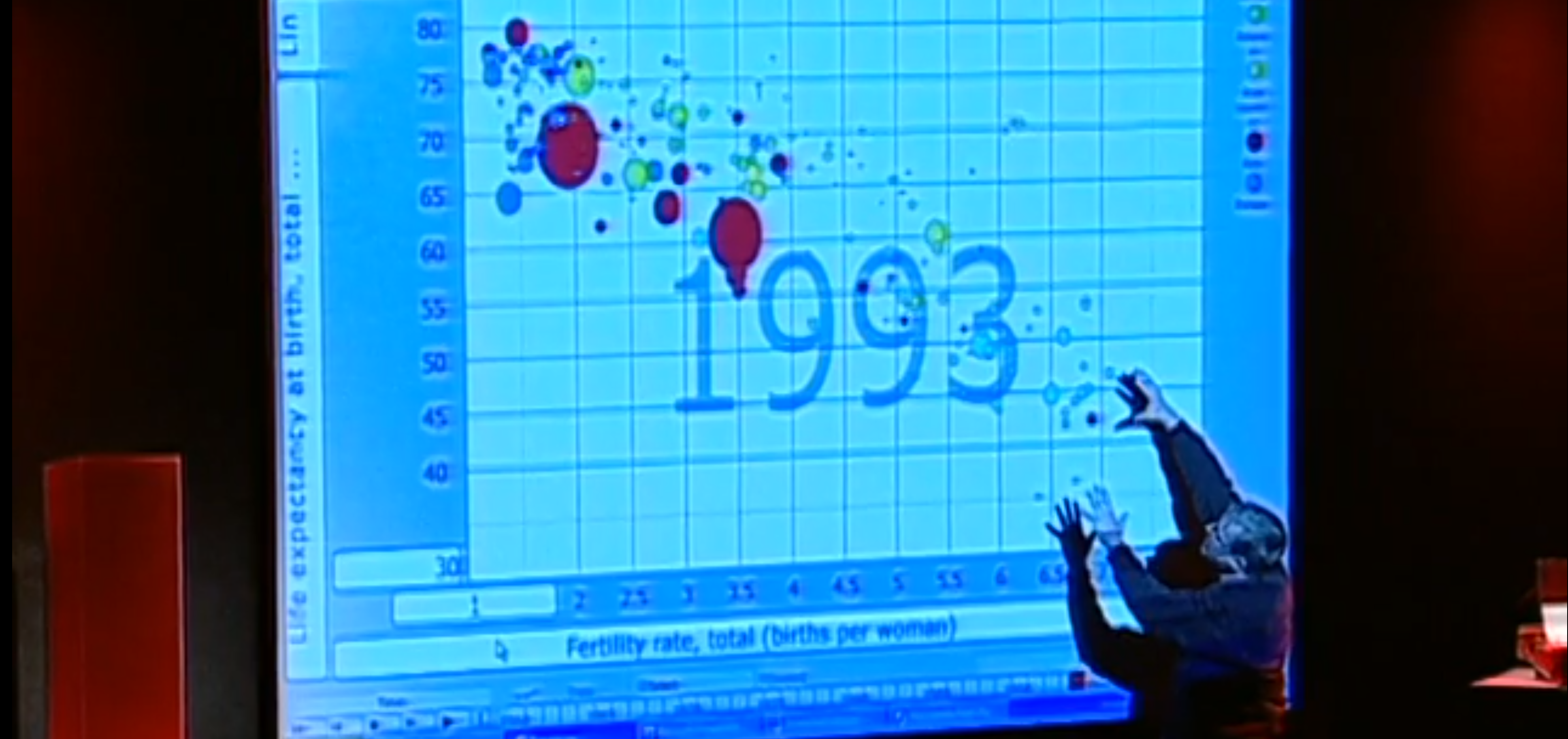
The first chapter of this book is really explaining what is Data Visualization. The author starts from a fairly abstract definition of “vis” (I will start to use this phrase from now on since it’s adopted by the author) and asking potential questions on the definition. Instead of writing a list that rephrases the things the author described in the chapter. I want to talk a little about something that really enlightened me.

In Chapter 1.2, when the author is trying to explain human’s role with the vis tool, she mentioned that the “many kinds of uses” of a vis tool which can be for both transitional use or for long-term use. This indeed opened up my mind about tooling in a large project, and possible usage of vis tools.

A simplest example is when we are writing a small project at school, most of the time we will print out debug information. Well, this is a primitive kind of visualization, which is not a “good” visualization simply because it doesn’t scale.

When the project gets larger, the time spent on tooling should grow respectively. And building a vis system sometimes is as important as implementing new features or even writing unit tests and integration tests. A great example is a monitoring system. It could be used not only for preventing regression introduced by adding new features or refactoring, but it sometimes can give out hidden patterns that will cause major crash. Just think of an unusual high I/O wait on your server, which sometimes is not sensible by your user but it could potentially hiding some defect in your HDD which will result in a total disaster in the near future.

With that said, a decent understanding in building good vis tools is very important not only for practitioners, but also for those who work in other fields that is related to complicated systems.

Data Can Become Source of Magic

Retrospect on Hans Rosling: The best stats you’ve ever seen

Hans Rosling "Casting" Data

I feel really lucky that I had the chance to watch this talk. Before that I never got Data Visualization.

Why is every body talking about it or how come people create a new discipline for something that’s really depending on intuition.

In this talk, Hans Rosling was like a wizard, whose magic is to manipulate visual elements to convey critical information or trends to his audience. I did’t get to it until I saw the pictures that all the lovely flowers grew on the soil with raw data embedded in it. But data is Hans Roling’s mojo (of course with his knowledge and experience in this field.).

What if you discovered oil before you invented the internal combustion engine?

The realization of that the data is the raw material which could be exploited and be used in some greater course, is no less than the invention of the combustion engine as inferred from Oscar Isaac‘s remark in Ex Machina.

Given that analogy, learning Data Visualization is more like learning technologies that build more efficient and more powerful engines. And for us computer science students or researchers, our duty is to practice and invent better tools that can help people build data visualization apps either used for a specific requirement or serve as a general framework that people use in a kind of situations.

At the end, please allow me to use another screenshot from Hans Roslings talk to remind me what we can do, and what we can achieve in the future.

Data Visualization Good vs. Bad

Good visualization can let people communicate much faster and easier, yet there are still some pieces of works that slows people down, or even worse, it could communicate the wrong information.

Here we will look at two examples that show us both good and bad visualizations.

Good Example

Below is a graph describing race distribution in U.S. The original graph can be accessed from here.
I think this graph is a good data visualization for two reasons:

  1. It uses the actual United States map that make the data in the visualization more intuitive. Anyone who has a little geographic sense about U.S. will know how to interpret the data.

  2. This data visualization uses the raw data in the “right way”. Which means it gives the raw data meaning that can let people find the underlying pattern. For example, if you are given a HUGE list of race-address information in text form, you will never figure out that black folks are distributed in the south and east parts of the country, but with this graph, you will know it at the first glance.

The Racial Dot Map: One Dot Per Person for the Entire U.S.

Bad Example

A bad visualization is usually some graph that communicates the wrong idea, or express the data in a wrong way. This one reminds us that the visual elements of a visualization is not trivial since it could plant the wrong information into the reader’s mind.

There are at least two problems with this graph.

First the three numbers doesn’t sum up to 100%, but that could be okay because there might be some context that we don’t know (like the classification of races mentioned in the graph.)

Another, which is more important, problem in this graph is that, the bars don’t work with the numbers (African American’s bar is way longer than the other two races while it’s percentage is smaller.). Although it’s possible that the author of this graph doesn’t intend to express the ration using the “bar”, but anyways, the graph still gives us an illusion that the African American portion has the biggest ratio.

Preface

友だち - ArseniXC from Pixiv

I created this blog by request of USF CS686 assignment. But it turns out to be a good place for some daily thoughts in Computing or Programming or even some other random stuff.