The Infant Mortality Data
I accidentally found this data from the Rdatasets, and it reminds me of Hans Roslin’s TED talk. So I decided to play around with it. (This data differs from Hans Roslin’s data in that it only captures the year 1970.)
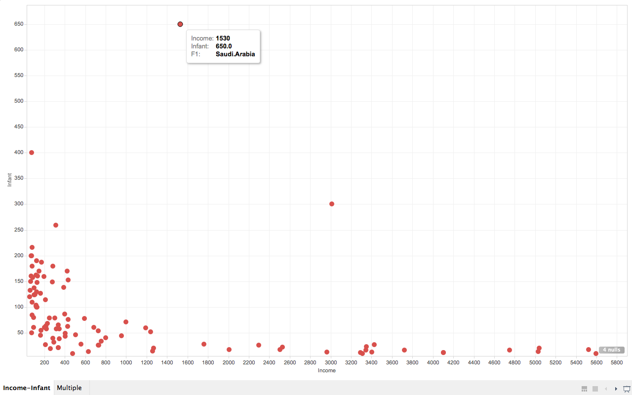
Correlation between infant mortality and income of a country.

As we can see from the screenshot, countries that are very poor have higher infant mortality than other countries are reasonably wealthy. But wait, what are the three points that are extremely apart from their peers (with similar income)?
So far I’ve only used drag-and-drop for dimensions and measures, and turns out Tableau knows what I want to do next, it allows user to drag and drop attributes in interest to “tooltip”. So I did it. And immediately it gives me a tooltip not only showing the dimension data, but also the extra attribute I just drag-and-dropped. And we can easily know that the three countries are (from left to right), Afghanistan, Saudi.Arabia and Libya and all of them are oil exporting countries! I’m not going to talk about world politics but the correlation to oil may reveal something.
Infant mortality and income according to regions.

By comparing infant mortality and income according to regions we easily know that Europe is the wealthiest and has lowest infant mortality, while Africa is in the reversed case. But Asia is not as wealthy as America but has lower infant mortality. Presumably the reason is that although Asia is not as economically strong as America countries, but by that time most countries in Asia is in a more stable state than their peers in some of the American countries. But to verify this point we need some other data support.
Wife Working Hours
This data demonstrates the working hours of the wife in United States families. It is more interesting if you have a wife :P
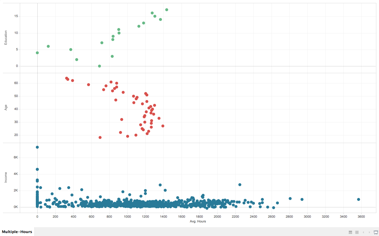
Multiple factors that affecting wives’ working hours.

In this chart, I deliberately chose three different factors that displays interesting pattern to the wives’ average working hours.
They are wives’ education level (measured in years, the more the higher), age, and husbands’ income.
In the first (from top to bottom) section of the graph, we know that wives that are more educated tend to work longer.
In the second section, the pattern shows that wives who are working most of the hours are between 52 and 21 years old.
In the third section, most of the wives who are working more than 400 hours per year has a husband that earns less than 3K per year (1987’s data).
README & Thoughts
How to use
You can download the Tablau Work Book files and the data here. In case it prompts data cannot be found, just use the data in the archive to replace the original data, since tableau seems to use absolute path.
Thoughts
This is the first non-coding assignment this semester, (hopefully the last ;P) which requires us to use Tableau.
I usually am not very patient with those “mouse-driven” applications that are advanced to an extent that targeted users are supposed to get their job done by only clicking their mouse. The reason is simple, because usually those tools will have some kind of limitations. But after a while using it, I actually found it was quite enjoyable to use it, the UI is quite intuitive and fluid in the mean time powerful. I believe it is a great tool that has the capability to let people who barely know computer science carry out much more complicated tasks in their daily works.