
Good visualization can let people communicate much faster and easier, yet there are still some pieces of works that slows people down, or even worse, it could communicate the wrong information.
Here we will look at two examples that show us both good and bad visualizations.
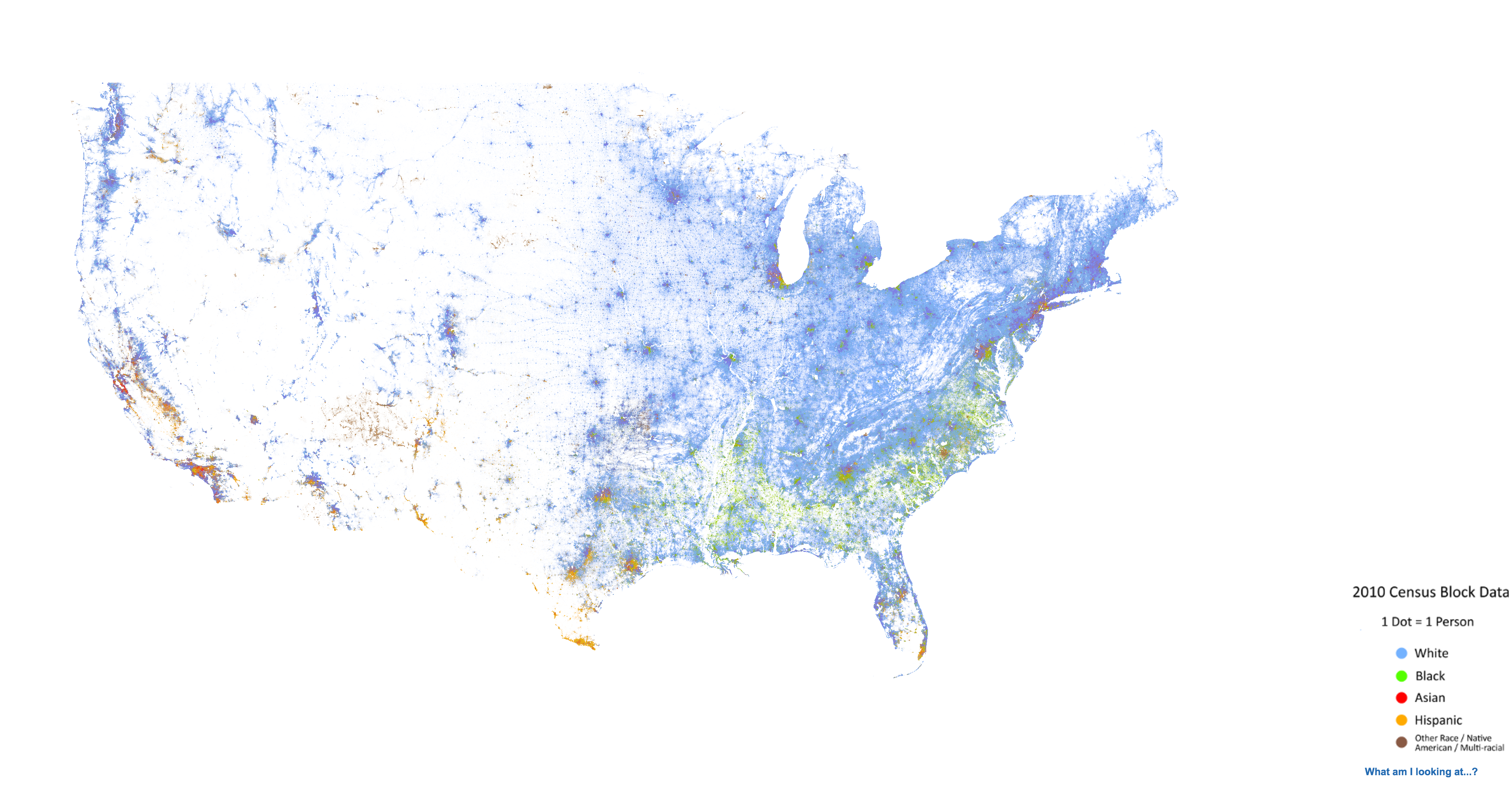
Good Example
Below is a graph describing race distribution in U.S. The original graph can be accessed from here.
I think this graph is a good data visualization for two reasons:
It uses the actual United States map that make the data in the visualization more intuitive. Anyone who has a little geographic sense about U.S. will know how to interpret the data.
This data visualization uses the raw data in the “right way”. Which means it gives the raw data meaning that can let people find the underlying pattern. For example, if you are given a HUGE list of race-address information in text form, you will never figure out that black folks are distributed in the south and east parts of the country, but with this graph, you will know it at the first glance.
Bad Example
A bad visualization is usually some graph that communicates the wrong idea, or express the data in a wrong way. This one reminds us that the visual elements of a visualization is not trivial since it could plant the wrong information into the reader’s mind.
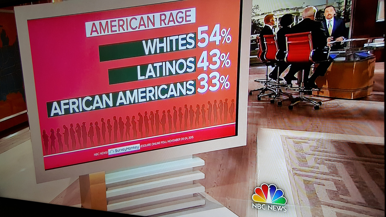
There are at least two problems with this graph.
First the three numbers doesn’t sum up to 100%, but that could be okay because there might be some context that we don’t know (like the classification of races mentioned in the graph.)
Another, which is more important, problem in this graph is that, the bars don’t work with the numbers (African American’s bar is way longer than the other two races while it’s percentage is smaller.). Although it’s possible that the author of this graph doesn’t intend to express the ration using the “bar”, but anyways, the graph still gives us an illusion that the African American portion has the biggest ratio.